Lagunitas Brewing Co.
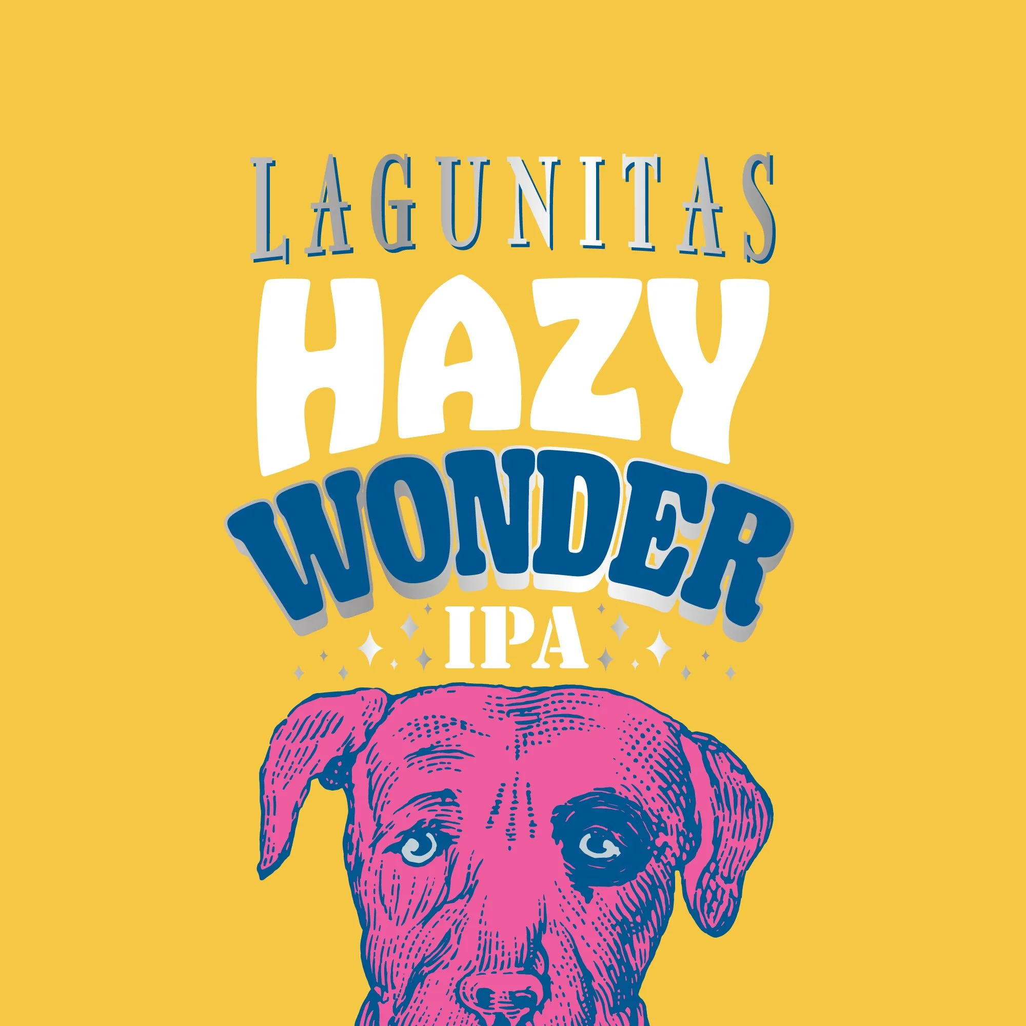
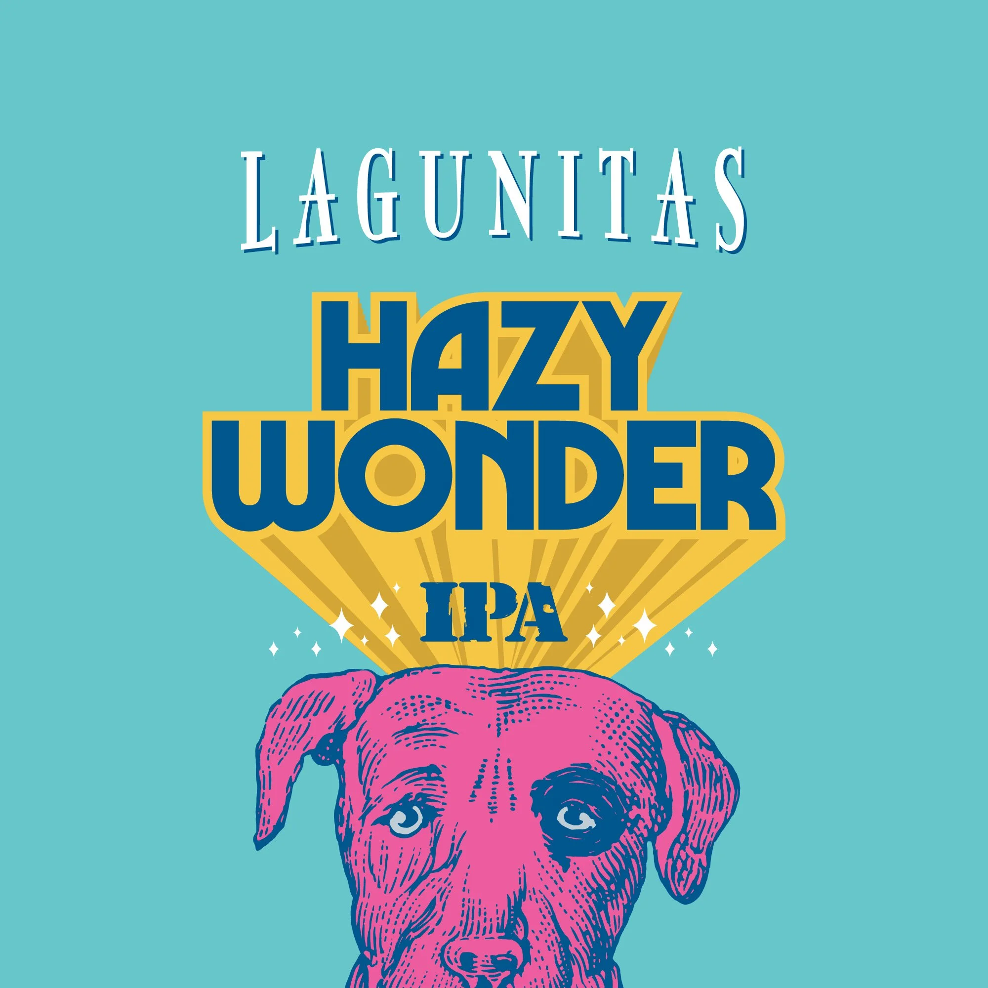
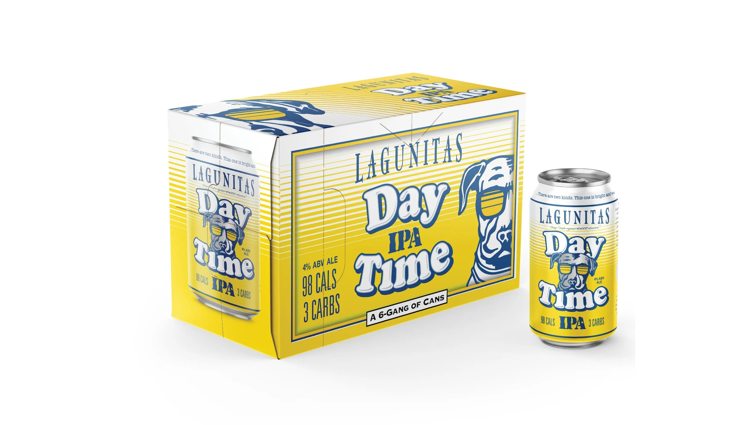
The team over at Lagunitas reached out about lending a hand crafting some new labels in effort to expand the packaging brand and give some of their seasonal offerings a point of differentiation. What began as a few limited-release SKUs grew into a larger scope; eventually helping to rethink their overall packaging system. From there we explored beyond just packaging - everything from new ventures, sub-brands, merchandising, and even the Lagunitas primary visual identity system. The following work is a compound of early conceptual explorations and final deliverables that have hit the market shelves.
Scope
Naming
Visual Identity
Brand Strategy
Positioning
Packaging Design
Web Design
Merchandise
Brand Maintenance
While the current wordmark held an iconic anchor to the brand, its delicate structure and fragile counters were easily lost on the shelf and at small scale. We were asked to create a wide swath of custom letters, all adding substantial weight to the letterforms and ranging from an evolution to a full revolution of the mark. While none of these marks were the final select, they helped shape the direction of where things ended up.
Before
After


