Upper Left Seltzer Co.
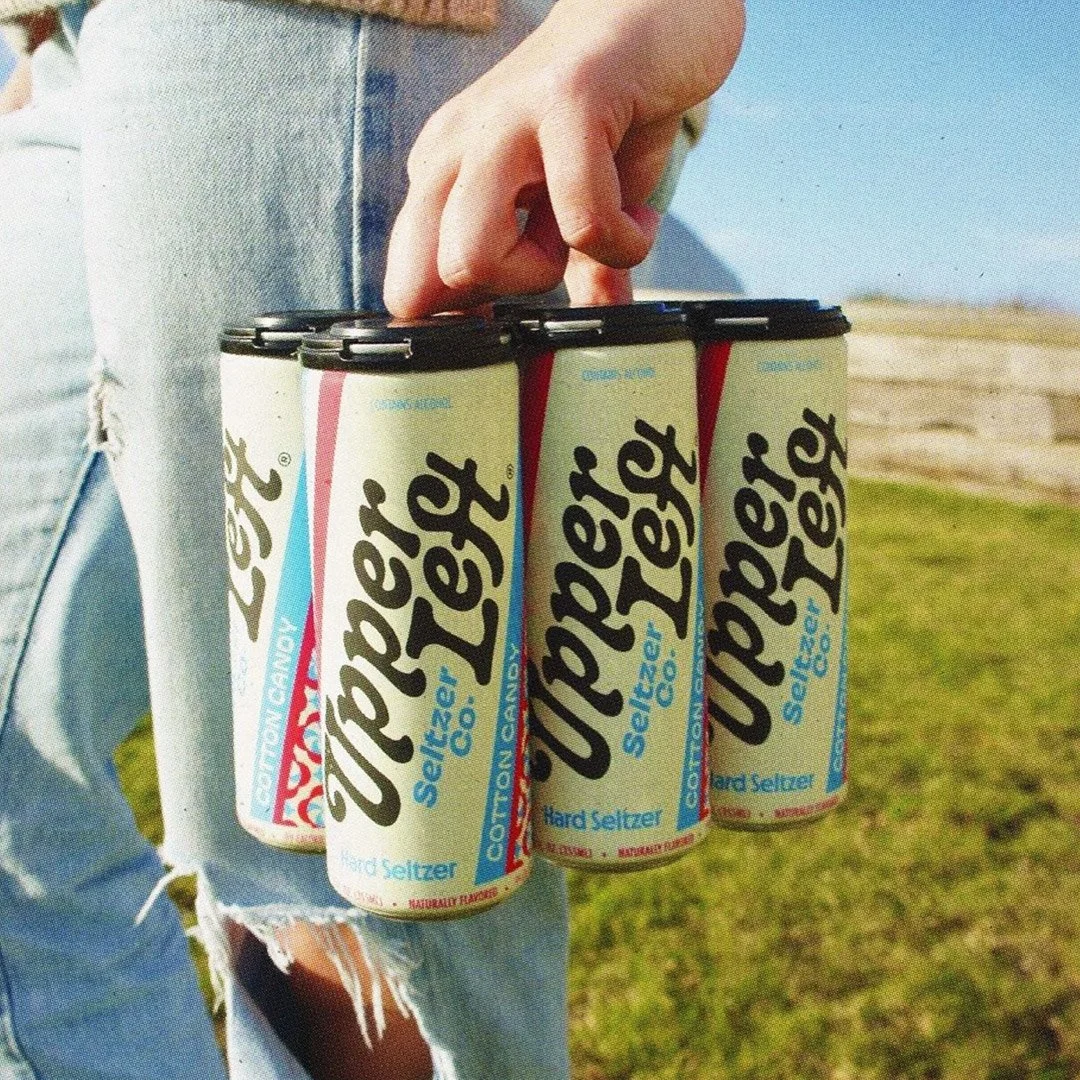
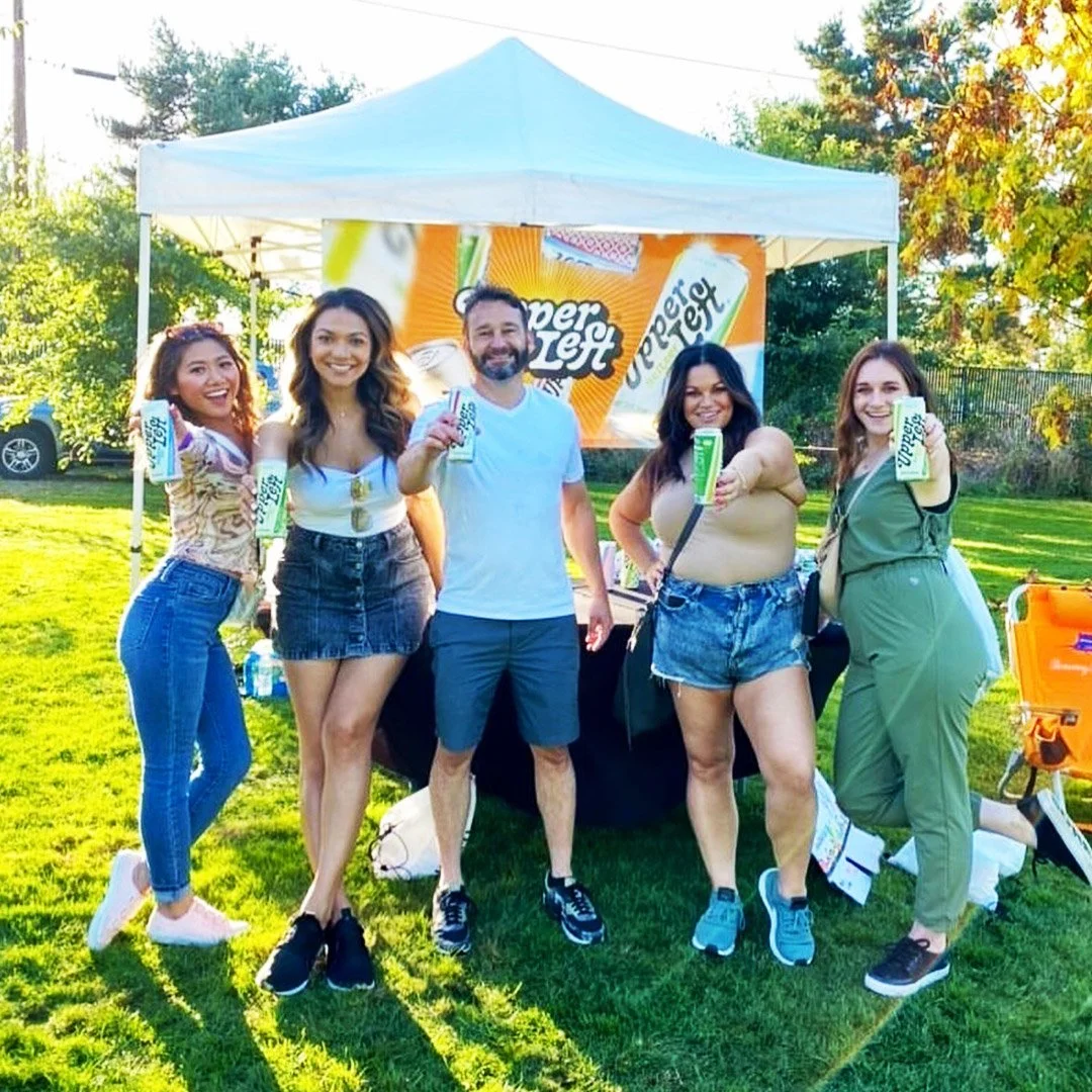
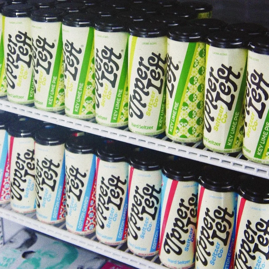
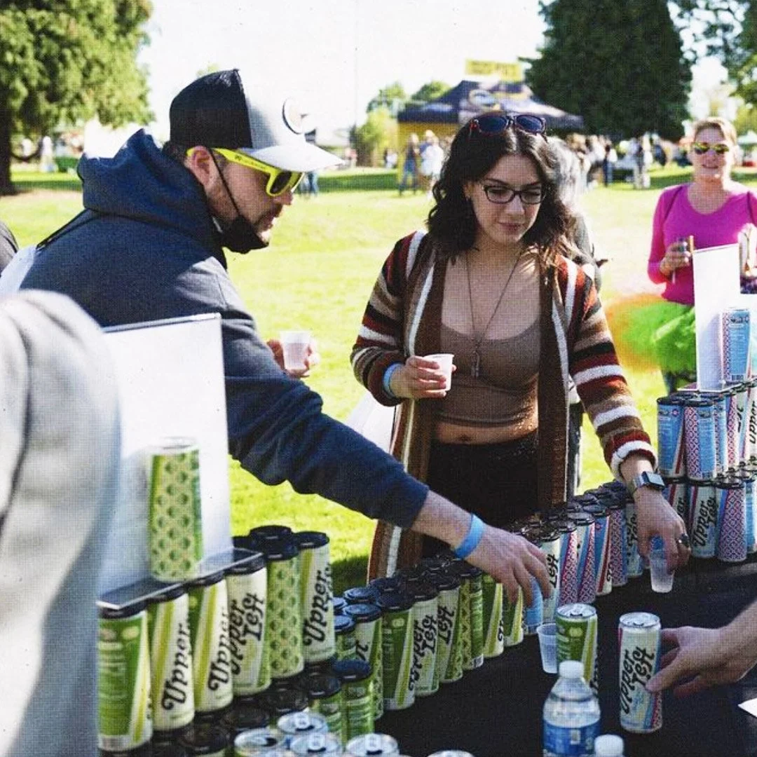
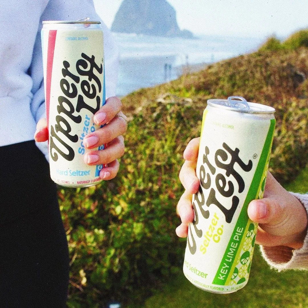
In the world of hard seltzers and the similar look that seems to be cast across every brand, the folks at Upper Left set out to find their own space. Driven by unique flavor explorations, Upper Left ditches the repetitive stark white cans and traditional flavors for a one-of-a-kind experience fueled by fun.
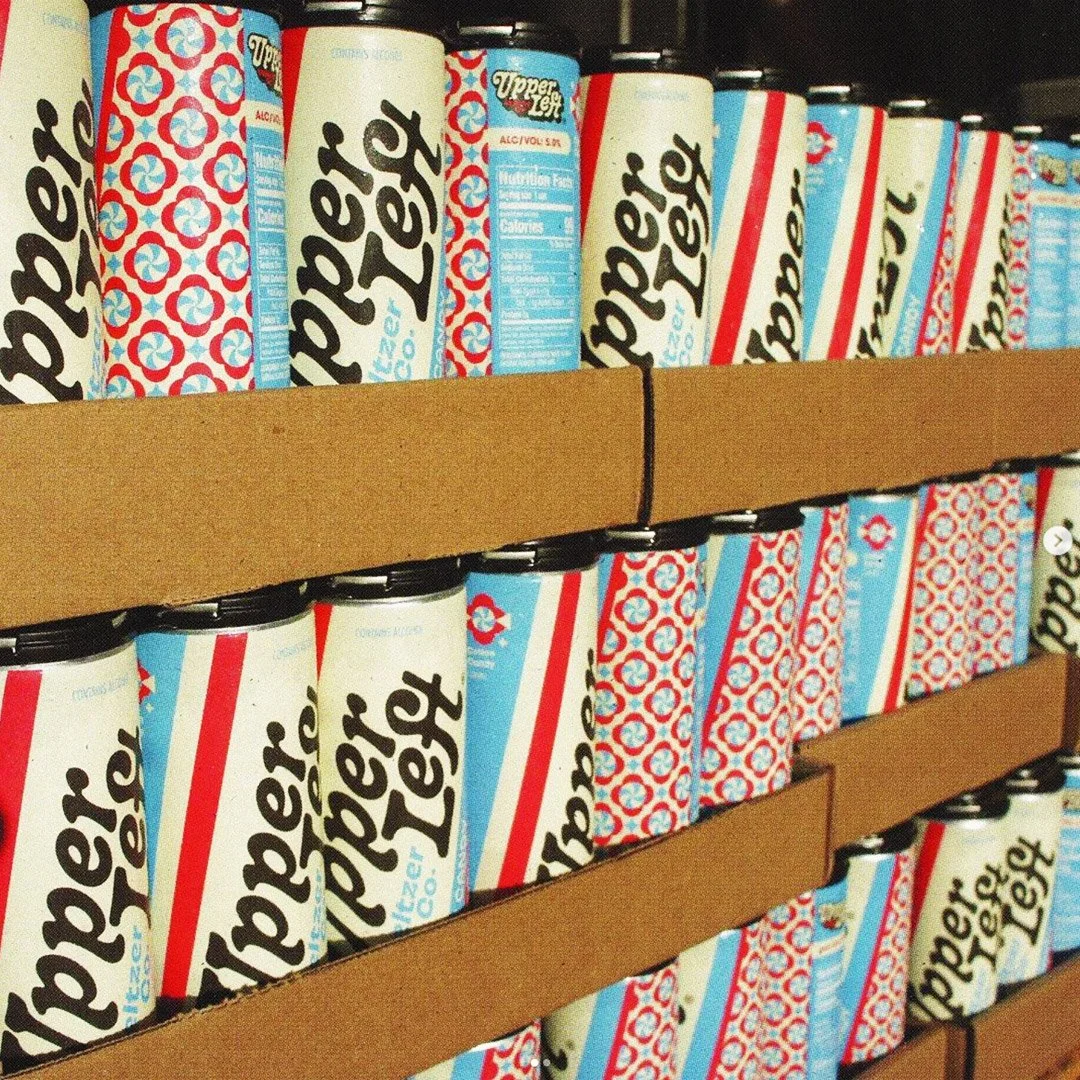
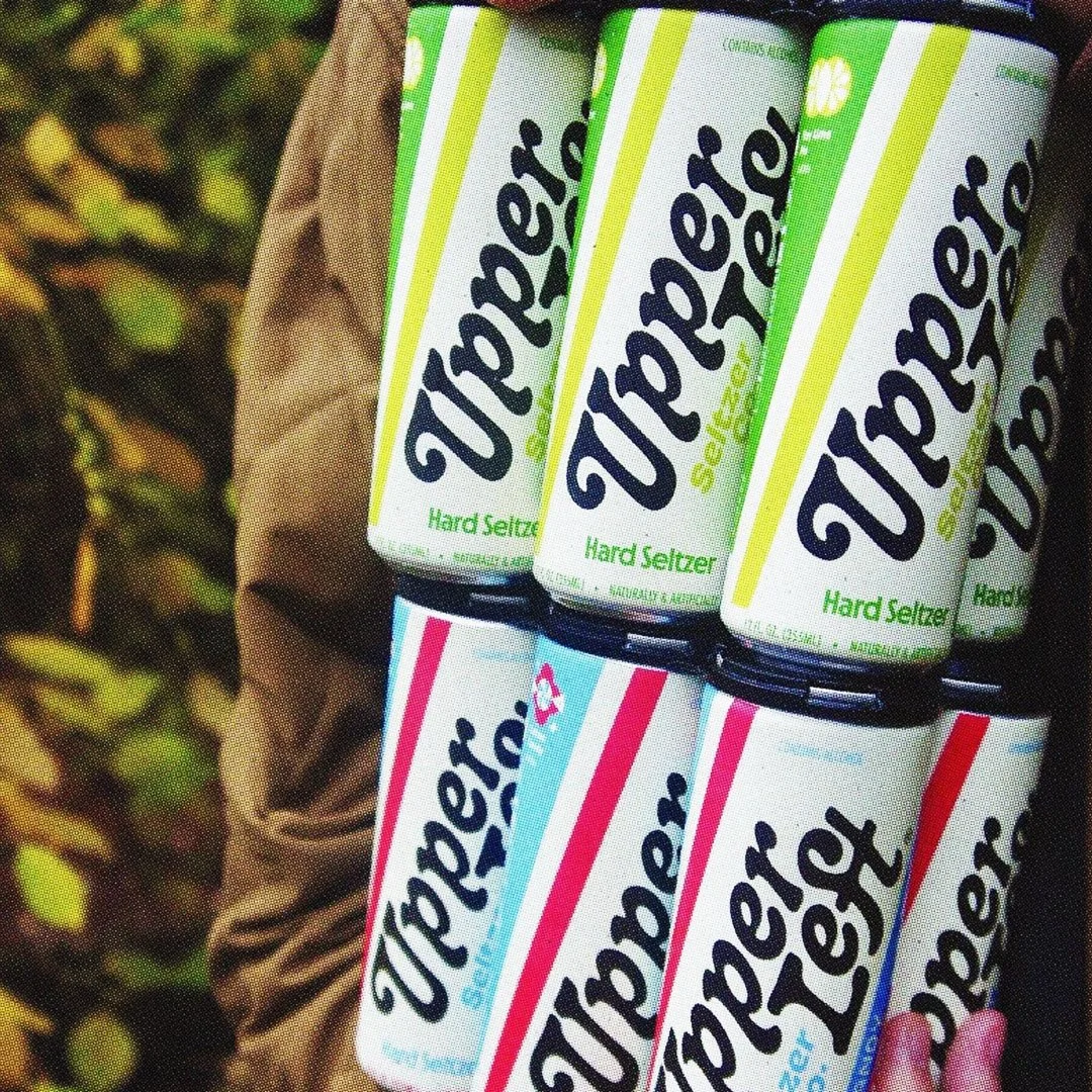
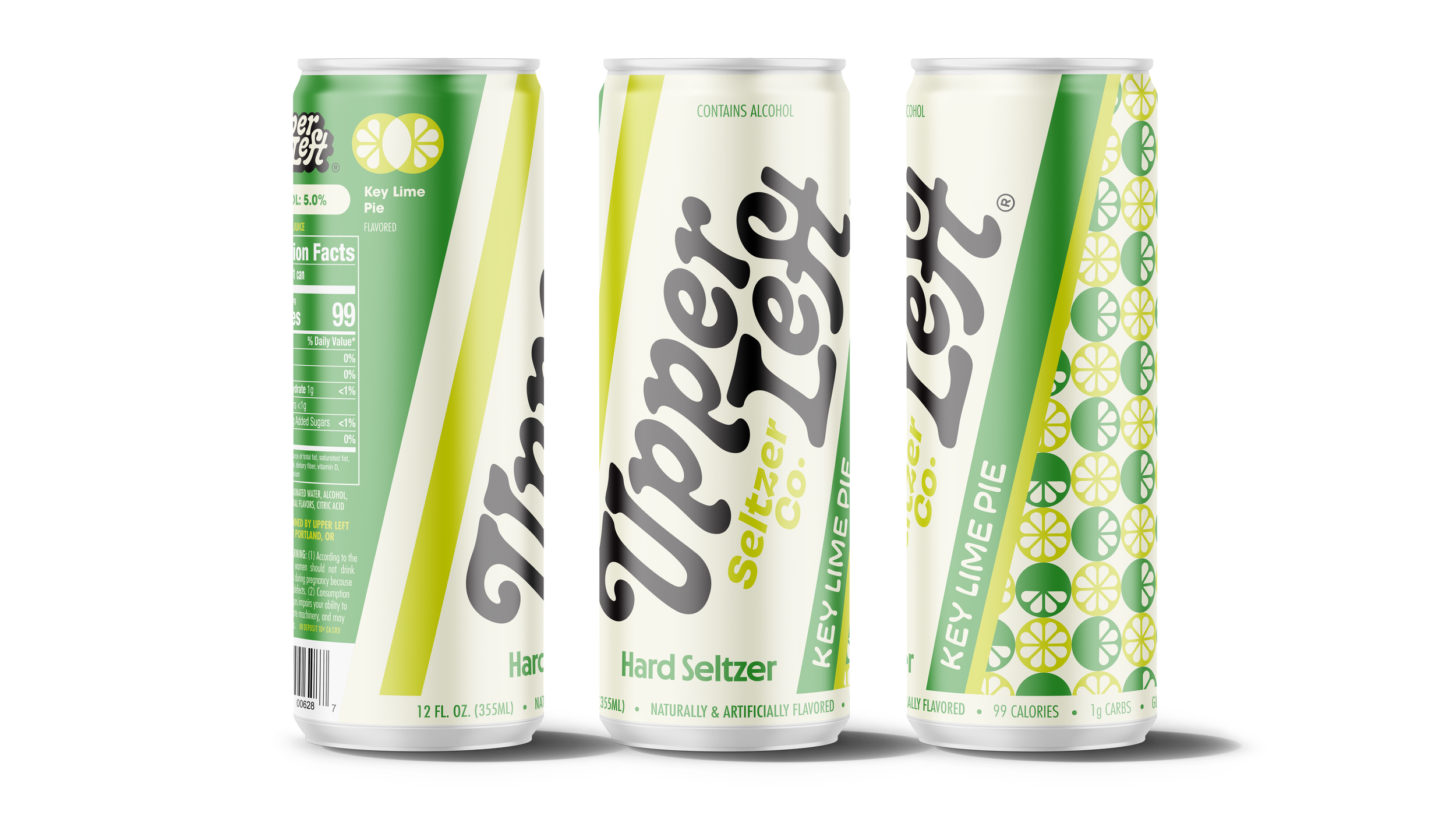
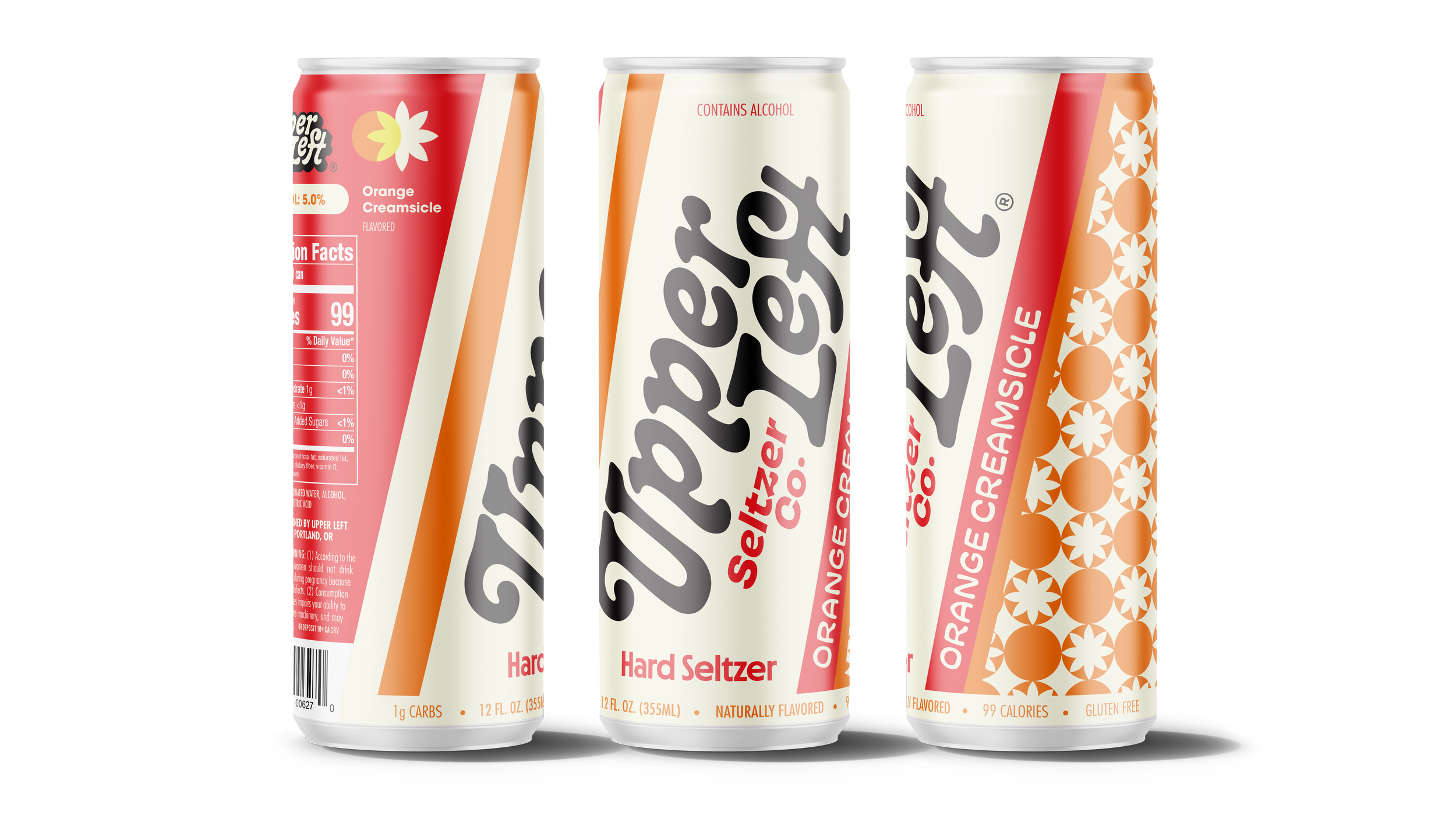
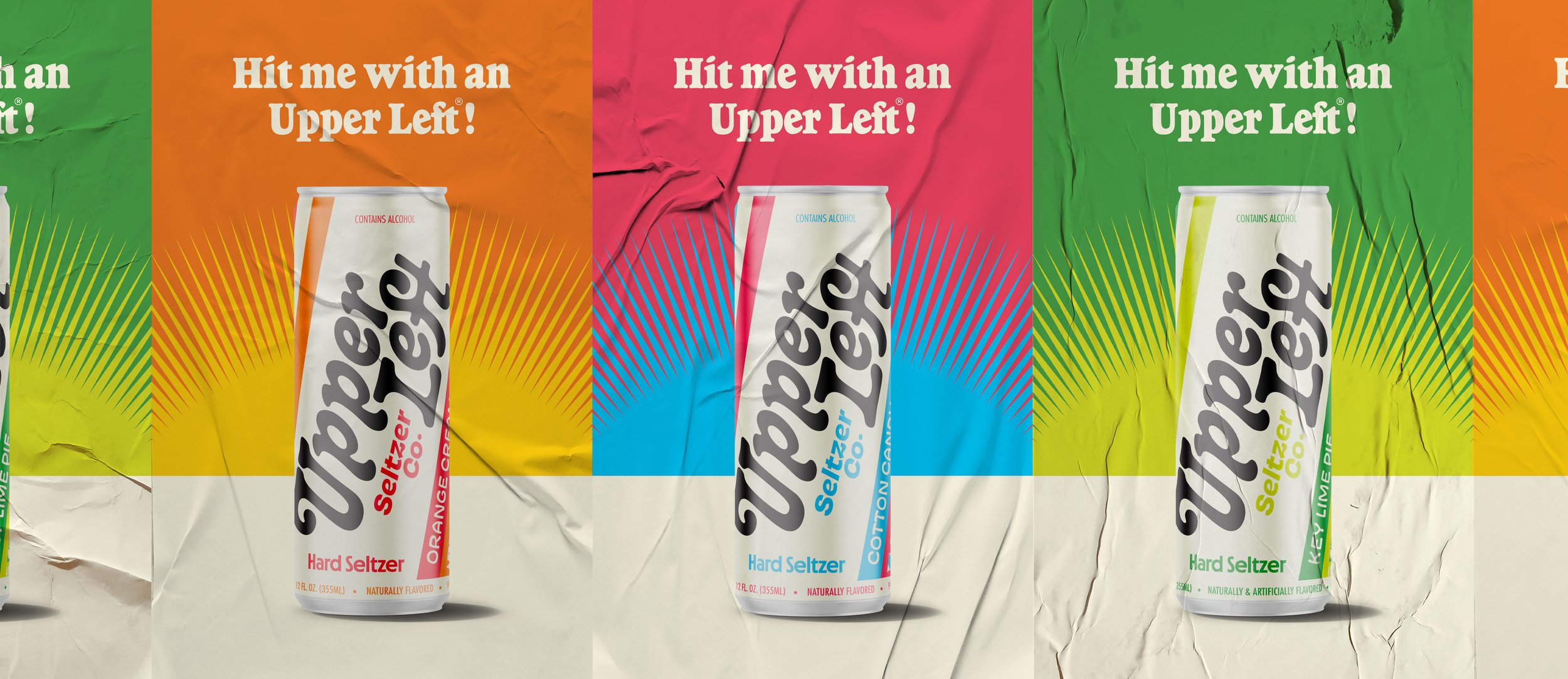
In effort to help put their vision into focus, we shaped their unique approach to the seltzer category by creating a brand and packaging system that drives their story back to the golden era of confectionary - celebrating the nostalgic tone of yesteryear.
Identity Guidelines
Visual Language
Voice & Messaging
Packaging System
Merchandise
Collateral
